
By Andy Shenk (this post reflects the author’s personal opinion)
To follow up on last week's post What Buses Can Learn from the Scooters, one of the most important components to the Better Bus Plan--which we released last November--is creating a visually striking map for Metro's most important routes.
A good public transportation map should accomplish two things: 1) Establish a brand for the system; 2) Highlight the system's most important features.
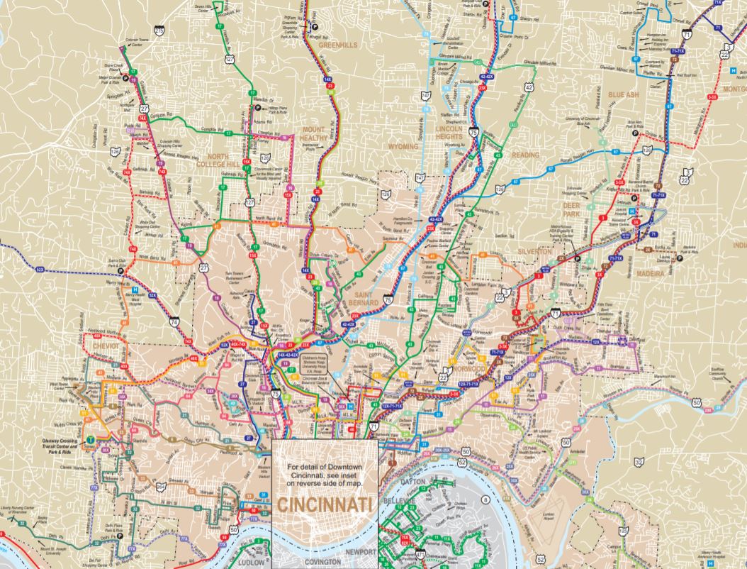
Metro's current system map does neither, which is typical for most bus maps in America. There is no design and therefore no brand. Perhaps worse, new users are unable to quickly identify which routes are reliable and which are not, not to mention where they go.
Metro’s bus map (see link above for map pdf)
That Cincinnati's bus map, and other bus maps around the country, ended up in such dire condition is not surprising. Since at least the 1950s, bus service has been viewed as a social service for those unable to use a car. As a result, there has been little emphasis on marketing the bus. For many civic leaders, the urban bus systems are an embarrassment and a reminder of the city's economic divides, rather than a prized asset.
Far too often, the point of the American bus has not been to facilitate the movement of people in cities, but rather to provide the lowest level of service possible to those physically or financially unable to use a car.
As a result, minimum effort is put into such "frills" as maps, shelters and benches, and so on and so forth.
Cincinnati's bus system is in dire need of many improvements. A map helps build a brand, not to mention an easy-to-remember guide to the system.
What is the first thing to pop into your head when you think of Metro? I doubt the system map comes to mind.
Now imagine a bold, yet simple design for the system's most important routes, covering the region's most important destinations. Imagine intuitively knowing the number, or perhaps the color, of each of Metro's major routes and where they went. Imagine giving directions by bus route, not by street or highway.
It may sound far-fetched in Cincinnati, or just about anywhere in America, but that is the potential of a map.
Apart from seasoned bus riders and Metro staff no one right now can visualize the bus system in Cincinnati.
Creating a map would be a first step toward addressing our general ignorance, even if it only contained the handful of routes with consistent frequency and service hours (e.g. 4, 17, 33, and 43).
The initial map would be simple, reflecting the inadequate levels of service in Cincinnati today. But there is beauty in simplicity. Not only would people be able to intuitively understand the current system, the map would also serve as stimulus for the system to grow. The evolution of the map would be a matter of civic pride, much like we once celebrated each new incline, streetcar, and highway.
By including every single route without distinction, including express buses and local buses with very limited frequency, Metro's map does not reflect reality. Sadly, there are few places which can be reached in our region by bus without significant inconvenience.
But that does not always need to be the case. A map is a canvas for dream, an invitation to chart new territories, or in this case, neighborhoods and townships. Allow Metro to dream and perhaps we will be surprised by how much we can accomplish.